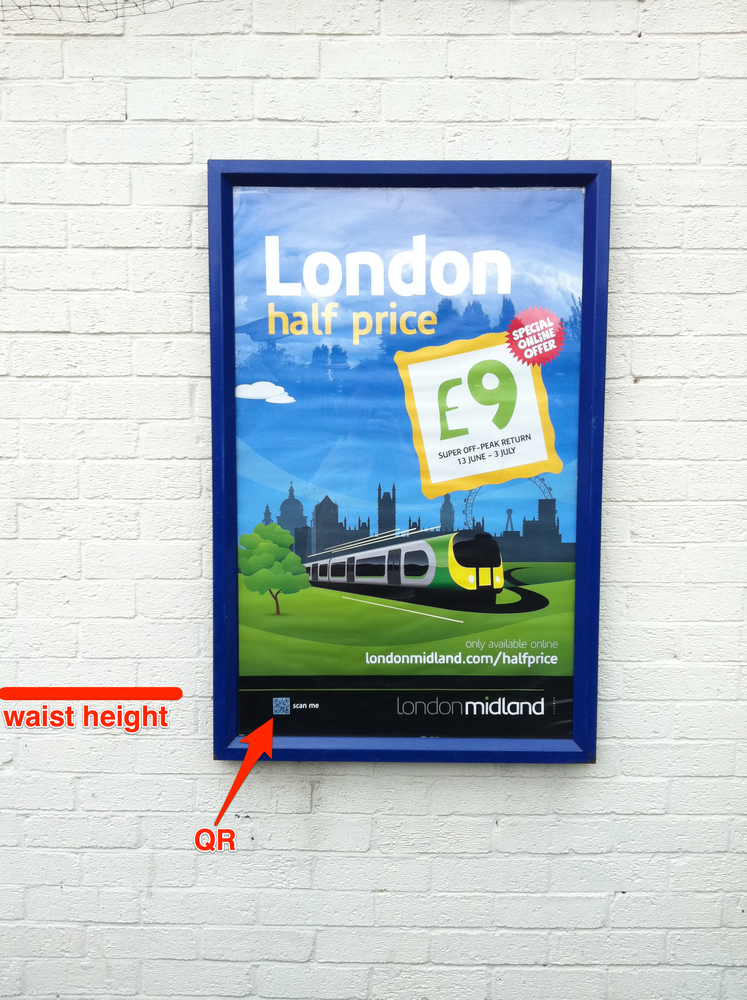
Dear print designers, if you want to use QR codes you need to think usability too
Dear Print Designer, I noticed your poster today at Perry Barr station. It’s an attractive enough poster, and very much in keeping with London Midland’s house style. I noticed you’d used a QR code with the call to action “scan me”. Now I’m a very obedient guy, so I did, but it was tricky,… Continu

Dear Print Designer,
I noticed your poster today at Perry Barr station. It’s an attractive enough poster, and very much in keeping with London Midland’s house style. I noticed you’d used a QR code with the call to action “scan me”. Now I’m a very obedient guy, so I did, but it was tricky, what with the QR code being down below my waist. I can see why you did this: there’s space there in the poster template, and perhaps you don’t want to clutter your artwork with this new fangled digital feature.
You’re clearly not convinced by the need to use a QR code, are you? Otherwise you’d have not been so thoughtless about this positioning. You’d have considered the feature’s function, thought about the context in which I’d interact with it, and made it accessible. You’d have had the confidence to have made it part of the design, not dropped it in as an after thought.
Essentially by offering this QR code you are making your poster an extension of my smartphone’s browser – you’re designing for screen, designing for Internet. Web designers think about usability, and you need to too.
It’s nice to see you experiment, but let’s learn from experience and move things forward.
Yours faithfully,
Jon
p.s. check your brand manual. The branding consultants are probably pretty pissed that you’ve nicked all that negative space from the company logo.